Eleven Colours in Film
As soon as it was possible, colour has been explored in cinema (even some black and white films try to experiment with monochromatic aesthetics, weighing more on darkness or lightness). Most of the time, a film will contain as many colours as necessary. However, some scenes will rely heavily on a specific colour to get a mood across. In fact, some entire films go for the monochromatic look, breaking the reality of a film in favour of an artistic interpretation or theme. So, we’re going to briefly look at what more obvious uses of every main colour would be. Of course, a colour can be used for many reasons, especially if the director, cinematographer, production designer, costume designer, and whomever else, explicitly gets their intentions across to audiences. Anyway, these will be the more blatant uses of these colours.

Red
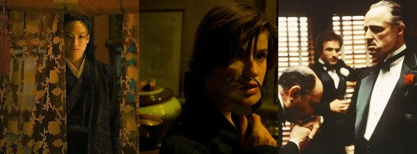
Red is the most attention grabbing colour, and it’s obviously attached to many particular themes: love and passion, or gore and murder. Her details many set and costume pieces as red to remind audiences of the developing romantic connection throughout the entire film (no matter the absurdity of the situation). A more abstract take would be Cries and Whispers, which is cloaked in crimson throughout, representing a tension, heightened feelings, and literal blood (of sickness, injury, and family) flowing throughout. To showcase a merging of themes, Volver blends Pedro Almodóvar’s heightened visual style and artistic direction with a murder subplot, so red is always shot richly and is fashionably used.
Yellow
Yellow isn’t used quite as often as the other two primary colours, but it is used strongly in seldom cases. This is to either make a film appear older, imagery seem richer and regal, strengthen rays of light, or to emphasize golden artifacts, vegetation (wheat), and other shiny imagery. Moments in The Assassin are a striking gold, as to help viewers spot the royalty of the characters found within the scene. The Double Life of Veronique is a bit of a murkier yellow (bordering a rusty olive at times), which makes each image feel like a foggy memory that still means a lot to the perspective featured. Then there’s a more iconic example with all of the Godfather films, toned in a light sepia to make the entire series appear like a moving aged photograph.
Blue
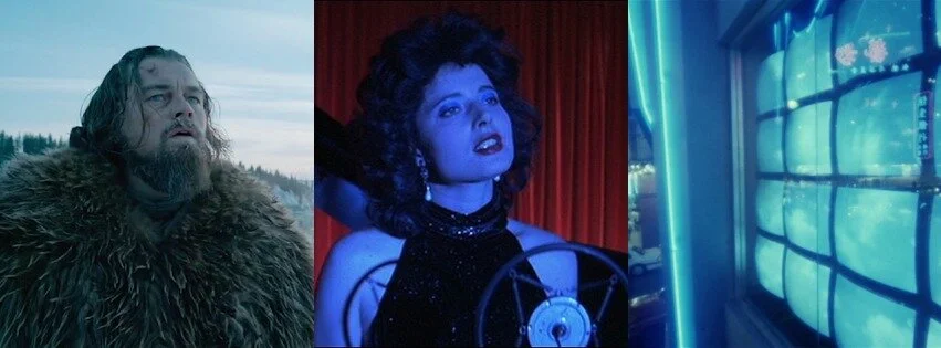
Out of all of the primary colours, blue is used the most. It can be as simple as adding texture to a nighttime scene, or as forceful as trying to make a moment feel as depressing as possible. Blue can be used for science fiction features as well, trying to add life to the futuristic imagery whilst not seeming too metallic or dark (blue works for more cynical sci-fis). Blue can also resemble the cold, which can be seen in all of The Revenant. Blue Velvet creates a dream-like metaphor of sadness whenever it uses shades of cobalt. Something like As Tears Go By almost seems either nostalgic (full of longing and sorrow) or of the future (sleek, radiant) despite being a more contemporary release, because of its many uses of neon blues.
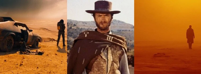
Orange
The first secondary colour is orange, mostly because it has one of the more singular uses: represent heat, dust, dirt, and fire. Many westerns, post-apocalyptic films, and other wasteland narratives will use orange, especially because of the clash against the blue sky that takes place (whereas a brown or grey setting wouldn’t be as effective). The orange in Mad Max: Fury Road is found in the barren landscape of the film’s setting, as well as the rust in the vehicles that take up much of the screen time (lest we forget the many balls of explosions as well). In The Good, The Bad, and The Ugly, orange is used for setting suns occasionally, but most of the film is implied to take place in scorching temperatures (the desert scene being a key example). Blade Runner 2049 is engulfed in orange at times to bring out the dusty, contaminated nature of an empty futuristic world.
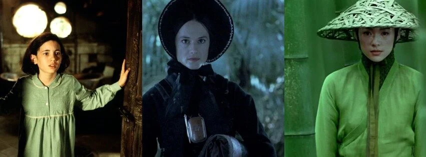
Green
Green has a much more pleasant nature, in that it actually resembles nature (for the most part). Many period pieces that take place in specific landscapes explore varying shades of green to capture the setting and departure from our own technologically expanded infrastructures that we currently know. Green can also be heavy in a fantasy film, like Pan’s Labyrinth, where much of the fairy tale takes place outside (in a forest, a stone maze, and other external locations). The Piano contains much New Zealand vegetative imagery in the 19th century, so there is always a tint of mossy green throughout the film. A stronger example is one of the outdoor fights in House of Flying Daggers, when a fight occurs in a bamboo forest (and combatants amalgamate with nature).
Purple
Since purple is my favourite colour, it pains me to say that it is possibly the least used colour of all in cinema. Other cool colours (blue, green) are used for moods or settings, and other dominant colours (particularly red and pink) are used for emotions. So, purple is a bit of an anomaly, but that makes it the perfect candidate for surreal imagery; perhaps a memory, or a dream. A key sequence in Moonlight is shot in purple instead of the usual blue, to resemble a traumatic flash back being revisited. In 3 Women, the implication that none of the film is literal is created by the constant use of violet shades, which only strengthen in tone as the feature continues. Enter the Void similarly uses purple in its out-of-body experience narrative, particularly a bright neon hue.

White
Moving on to the two shades now, I’ll begin with white. Outside of black and white features, white is used either for innocence and naivety, coldness and alienation, or bright radiance (when combined with light). White can also be futuristic when used in science fiction pieces, creating a more friendly look at the future (as opposed to blue or grey). In Nosferatu the Vampyre, white makes the entire picture seem lifeless in a gothic sense, well before we even set eyes on the titular vampire. On the contrary, Veronika Voss is brightly white, which flushes out the shadows in the entire feature, washing out the imagery in an almost spiritual, angelic way. Black Swan counters between both shades, but uses white to focus on the purity of the callow, shy lead character.
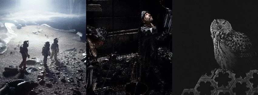
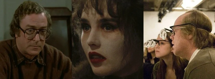
Black
Then there’s the other shade black, used either cynically or to enhance mystery (sometimes both). Darkness is often avoided in film and can be used sparingly. If not, an entire feature can seem dismal (which can easily be the intention of a director). Alien alerts audiences of the misfortunes to come as the crew explores an obsidian landscape. There Will Be Blood occasionally basks in darkness (with oil, mainly) and captures the nature of greed and pride. Then there’s Sátántangó, which is fully cloaked in shadowy imagery, creating an existential uneasiness its entire duration with almost zero let up.
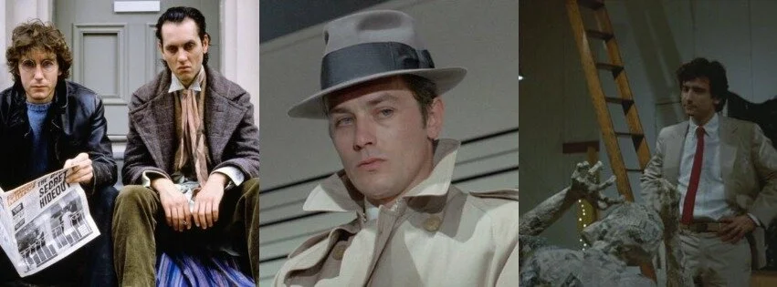
Grey
Combine both shades together, and you get grey. No matter if it’s to detail a futuristic world, a current setting, or the past, grey will turn anything dull, dull, and more dull. This is entirely intentional, whether to detail a mundane world, or represent boredom with one’s surroundings. The latter can be seen in Withnail and I, which champions the escapades of two delinquents in a dreary existence. Le Samouraï is also purposefully cold and drab, as it showcases the soullessness of the life of a hitman. After Hours is, once again, concerned with a lead character’s monotonous life, only to be interrupted with the wearisome task of trying to get home for hours and hours on end.
Brown
We have two final main colours, but knowing how they are made is important to their usage. Brown is the mixture of every colour together (in an artistic sense, including paint). While brown can be associated with grossness (mud) or deliciousness and beauty (chocolate, textured wood), it is often a bit of a livelier example of what grey can do. Instead of a dreary universe, brown is a bit more prestigious, tonally acceptable, and finer to look at, all while achieving similar outcomes. Hannah and Her Sisters is full of fatigued souls, yet the use of brown allows for family dinners, well kept studies, and fashion to still resonate even just a little bit (without looking entirely bereft of life). Camille Claudel merges the iconic sculptor’s works (particularly bronze and clay) with the emptinesses in her life; the result is a more poetic take on coldness, rather than what grey alone would have offered. Synecdoche, New York is purposefully vapid, as it mixes production scaffolding and construction with bland fashion, creating a stage life full of uninspired, aimless characters.
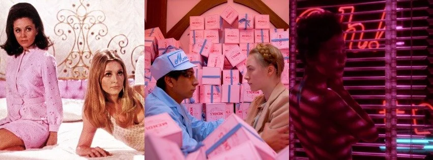
Pink
We end off on pink: the combination of red and white. So, passion and purity can result in either fleeting love, retro nostalgia, sugary aesthetics, or eroticism. Valley of the Dolls is a muted pink throughout, resembling the lingering dreams of being loved, even through the anguishes of the lead characters. The Grand Budapest Hotel is a bit of a more innocent approach, being invested in unrealistic, picture book imagery, and the film’s obsessions with baked goods (centred around a youthful romantic subplot). Mishima: A Life in Four Chapters uses a hot neon pink in a particular scene meant to create feelings of passion during sexual exploration.

Andreas Babiolakis has a Masters degree in Film and Photography Preservation and Collections Management from Ryerson University, as well as a Bachelors degree in Cinema Studies from York University. His favourite times of year are the Criterion Collection flash sales and the annual Toronto International Film Festival.