
Blue and Green in Films
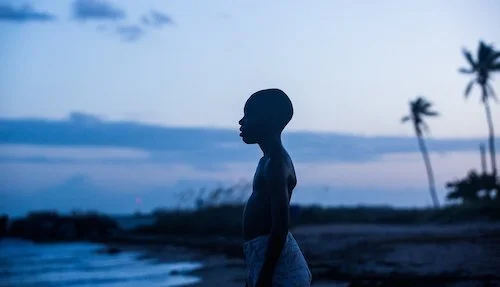
Moonlight
Cinematography can be the simple use of photography to tell a story in film: an obviously visual medium. Some filmmakers favour richer visuals, which usually stems from their connection with their cinematographers. Visionaries like Christopher Doyle, Roger Deakins, and Jordan Cronenweth (amongst many others) can use colours to wring out as much content out of a single shot as possible. This can be particular feelings, the evocations of time periods, or a means to match the overall mood of a film. We can go over other uses of colour in film over time, but the two cool colours blue and green seemed like a nice place to start. With these hues, I personally envision soothing feelings, or the invitation of me to extract how I want to feel. With hotter colours, more of a statement is being made. With these cool colours, it’s almost a meditative experience. It reminds me of jazz, with the possibility to get lost amidst what I am hearing (only this is what I am seeing). Like the world around us — with water and vegetation — these types of shots are more natural in tone, and so they feel tangible.
So, what can you get with these colours, with all of those sensations in mind? You can pull off a lot, actually. The most obvious kinds of shots that benefit the uses of blues and greens are, naturally, nature shots. You can make forests or yards pop, and just those two examples alone convey different messages; a lush forest means a nurtured habitat, whereas a green yard usually means a wealthy house owner. The tweeking of these hues of green can also adjust how these landscapes come off. Maybe the yard isn’t well tended to. Maybe the grass in the yard isn’t meant to be the focal point at all. In that same breath, a strong blue can light up the pool of that vibrant yard to emphasize the wealth of this character, in the same way a deeper blue can paint the night sky as it sets in to a scene, causing an embrace of the impending darkness rather than fear. Blue skies during the day can represent breathable air, which wouldn’t necessarily work in a dystopia, but it would make perfect sense in an oasis, representing the need to quench a thirst, and the search for water.
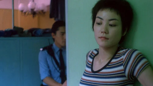
Chungking Express
Since setting is usually visually told in cinema, colour ends up becoming a part of that conveyance. You can apply different colours and shades to varying settings to get a series of results. The key is to play into what the film demands. Would a buddy-cop film benefit from neon colours? I think the visual nature of a film like that would be better taking the backseat, although an effort in making it look presentable is always a must. It just doesn’t have to be a film that’s primarily told through its colour schemes. A keen sense of what colours work when is always necessary, though.
Of course, there are a multitude of different possibilities when it comes to playing with colour. The natural examples I gave are a bit more obvious, because we understand the correlation between green plants and blue waters and skies. How does one portray specific moods? Happy is bright. Sad is gloomy. Angry is fierce. All of that makes sense. What about something more complex like nostalgia? An example is Doyle using green and other muted colours throughout Chungking Express, and the specific type of lime-green found throughout evokes a number of sensations. Firstly, there’s the speed of the city, which isn’t a murky grey in any way, so the backdrop matches the life of the surroundings of the lead characters. Then, there’s nostalgia. Both lead cop characters have pasts that linger in their minds, including a broken heart. Having a bright colour (but not too, fantastically bright) causes a longing for something we don’t really ever see, save for a couple of scenes. All of Chungking Express feels like a daydream, and a big portion of that has to do with its colour scheme that is cool, but not too cool. Blue with a dash of an attention-grabbing yellow creates an awareness, but not to anything in particular.
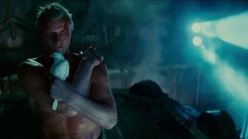
Blade Runner
We can keep going on about examples, because cinematographers are masterminds at figuring out all of the substance of an image, which includes colour as well. However, we’re forgetting an important element of a shot: lighting. In relation to colour, how does lighting come into play? Take the above image from Cronenweth’s Blade Runner. Had the light pouring into the shot been white or a warm yellow, maybe the scene would be less chilling. It may appear angelic, especially with Rutger Hauer clinging onto the pigeon in such a formation. We see yellow earlier in the film, but that’s saved for the upper class members of society who can afford to see the sun. In the rest of Los Angeles, blue dominates every scene. Grey would work too, but Cronenweth went with blue, because it meshes well with the neon aspects of the futuristic film (one colour representing infrastructure and tone works well). So, the blue peering in here is indicative of the entire film, but it’s also a reminder that even the slightest shreds of hope are chilling in an eerie way.
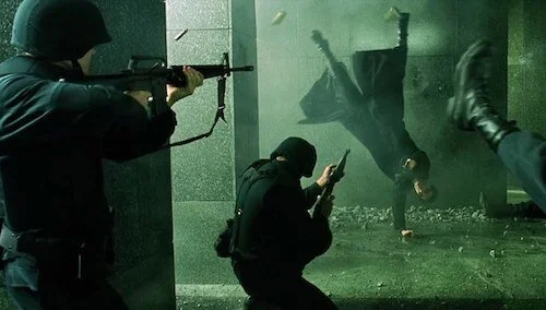
The Matrix
Once you start tinkering with adding strong colours to lights, a film’s nature can swiftly change, especially with such a heavy focus on aesthetics. When you colour grade shadows, that’s when a feature is borderline monochromatic, and a major portion of a film’s draw is its visual nature by this point. The Matrix — perhaps the most popular film to employ green in such an obvious way — reminds you of your place within a digital realm its entire time. Everything is varying shades of the same colour that matches the dripping computer characters found in the opening credits, and so every image in the “Matrix” itself is a piece of coding brought to life in this illusionary world. With the shadows even being part of the green spectrum the film boasts, the image itself is flattened (intentionally), heightening the fantasy elements by stripping each shot of photographical depth we can grab onto. The Matrix is clearly invested more in being a moving comic book or of the same nature of a video game, and that enhances the action motifs greatly.
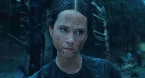
The Piano
So, why blue and green? Why do those two colours go so well together, as opposed to many other combinations (one of which we will get to later)? Well, the back-and-forth that can happen between both blue and green is convenient, and not just in an Earthly sense. Yes. It’s time to discuss teal. Teal can be the middle ground of both colours in both a neutral and a heightened way (depending on the focus). Take Stuart Dryburgh’s photography in The Piano. Between olive greens and pastel sky blues, there is a smokey teal that blends both colours together, particularly in moments like the above shot (where rain darkens an entire setting). Keeping with the natural landscapes of New Zealand found in the film, the use of teal here allows the greenery to still pop, even when it isn’t the focal point of the darkened, wet scene. Of course, green itself can be blended with other colours (see the below shot in The Double Life of Veronique, where green and yellow turn a shot into a rusted gold), but in the case of working with blue, green enhances the natural essence of blue. In Blade Runner, the setting is cold and void of life, so green is not prominent. However, a lack of blue may cause a loss of other elements, including the sense of a sky or dampness. The Matrix is as claustrophobic as Blade Runner, but the former film feels less wet, even during scenes of rain. You can just sense the chill in the air for Blade Runner at all times.
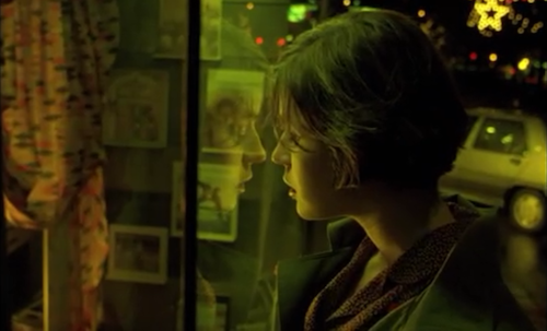
The Double Life of Veronique
The most popular type of colour combination is the now notorious blue/orange duo, mainly because these two colours are contrastive of each other (blue is not found in orange). Unlike other contrasting colours, blue and orange can be forced into many shots or photographs, including a loud sun in a cool sky, or fire and ice. We may get into that whole ordeal another day. For now, blue and green is a pairing I find much more organically pleasing, and both colours — by themselves or together — are commonly used to bring an extra sense of life or atmosphere to otherworldly shots. Because of what we are acustum to in the human experience, this colour scheme pulls from what we know — or familiar with — and creates a graspable image, even in worlds we will never experience.
Here’s until we touch upon other uses of colour in film.
Andreas Babiolakis has a Masters degree in Film and Photography Preservation and Collections management from Ryerson University, as well as a Bachelors degree in Cinema Studies from York University. His favourite times of year are the Criterion Collection flash sales and the annual Toronto International Film Festival.